Aa
Headings
Oswald
DESIGN WITH A BITE OF BITE.
500700
ABCDEFGHIJKLM
nopqrstuvwxyz
0123456789 &?!
A brand built from the ground up for a housing and real estate start-up that wanted to look as solid as the homes it planned to build.
JPRE was a new housing development and real estate business getting ready to launch. There was a name and a plan, but no brand to speak of.
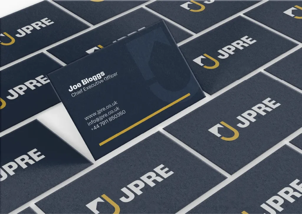
They wanted something bold and high-end that still felt approachable, and clean wherever it appeared. It needed to look just as good on a site hoarding as it did on a buyer's brochure.
We started with who JPRE are really talking to: first-time buyers, families moving up, investors, and the landowners and partners behind each site.
From there we developed an identity: a logo, a colour palette, a type pairing that feels premium without feeling cold, and simple rules to hold it all together.
The brand was finished and ready to roll out, but the business itself didn't get off the ground. That happens, especially with start-ups, and it doesn't change the work.
We're still proud of where this one got to, so we wanted to share the thinking behind it.
Buying a home is a big decision. People are trusting a developer with their savings, their family's next chapter or their investment, so the brand had to feel dependable before anything else.
Plenty of developers manage dependable and end up cold. Heavy type, navy and gold, a stock photo of a smiling couple holding keys. We wanted JPRE to feel premium and still easy to talk to, the kind of company you'd happily ring with a question.
That balance shaped every decision. Strong, simple shapes and plenty of space give the brand its confidence and high-end feel.
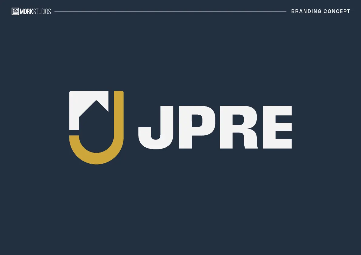
The mark starts with the J from JPRE, drawn in gold to stand for the company. The space inside it holds a home, a nod to the industry they work in. Together they form a shield, a simple sign of the trust and security people look for when they're buying a home.
Beside it, the name is set in a heavy, wide sans-serif in capitals. It's solid and confident, and easy to read from across the road.

DESIGN WITH A BITE OF BITE.
ABCDEFGHIJKLM
nopqrstuvwxyz
0123456789 &?!
Clear, friendly and easy to read at any size.
ABCDEFGHIJKLM
nopqrstuvwxyz
0123456789 &?!
Got a project in mind, or just a hunch? Drop us a line and we'll come back with ideas, a clear quote and honest timings.
hello@bearlycreative.uk