Eclipse Broadband
A brand for an internet provider built for gamers. Fast, sharp and confident, with a single idea at its heart: nothing should get between a player and their best game.
The brief
Eclipse supplies internet to gamers who care about every millisecond. They needed a brand that felt as quick and reliable as their connection, and that spoke to players rather than to IT departments.
The approach
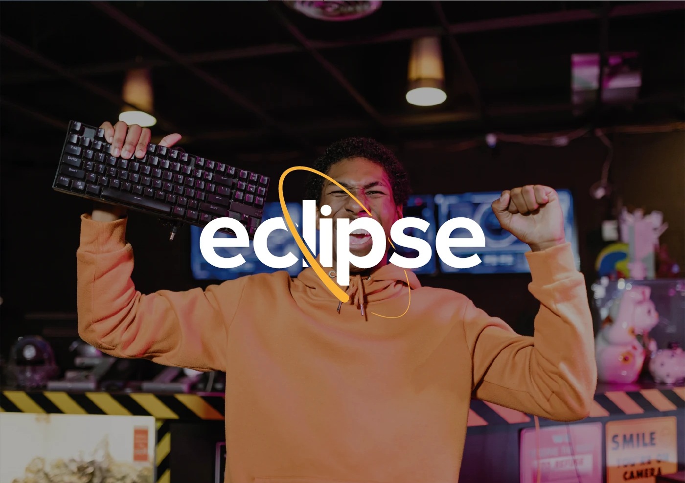
The logo pairs a clean, heavy wordmark with a yellow orbit that cuts through the letters, like a signal moving at speed. It works small on a router and big on a billboard.
The result
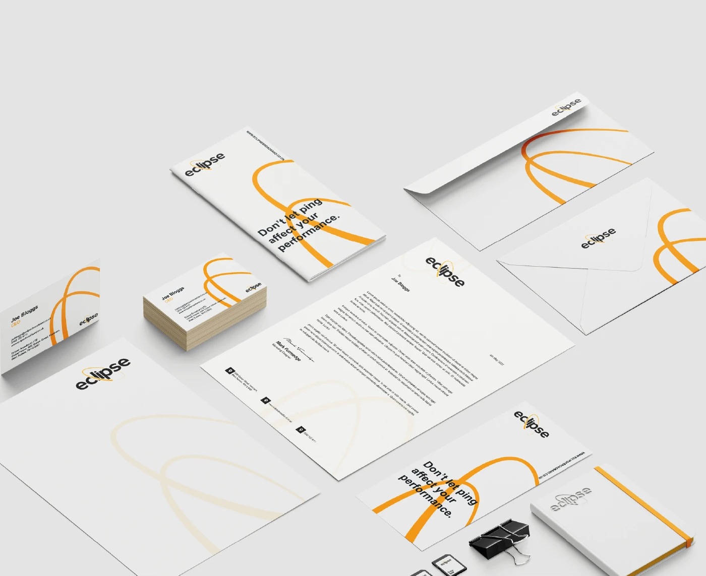
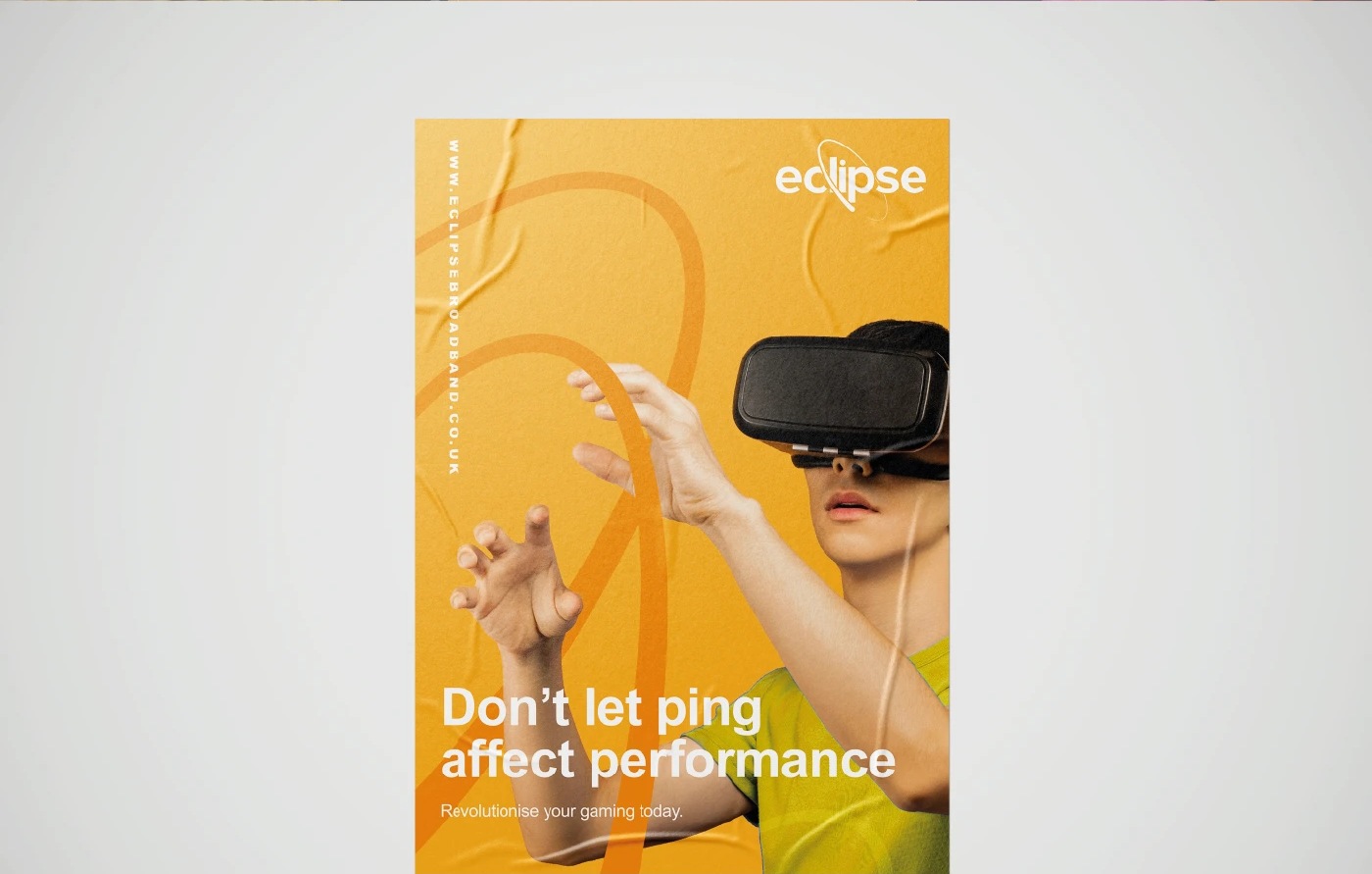
A full identity, from the logo and stationery to a campaign line built around what gamers fear most: "Don't let ping affect your performance."
Dark, bright and fast.


The idea.
Gamers already know the pain of lag. The campaign skips the speed tests and jargon and goes straight for the feeling: losing a game you should have won.
The yellow orbit runs through everything, from billboards to posters, so the brand is recognisable even before you read the name.