Aa
Headings
Bricolage Grotesque
COME ON YOU FOXES.
800
ABCDEFGHIJKLM
nopqrstuvwxyz
0123456789 &?!
A bold rebrand for Fairfield FC, built to capture the club's energy and identity on and off the pitch.
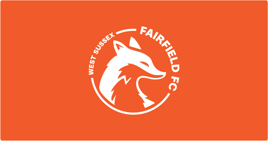
Fairfield FC is a football club based in Burgess Hill, and it was overdue a clean crest that spoke to the feeling of the club.
This one was close to home. Mark used to play for Fairfield, so we already knew what the club means to the players, volunteers and fans who turn up every week.
The aim was a look with real energy. Something fans would be proud to wear on matchday, and that would stand out in photos, on social media and on the pitch.
We started with the crest and built everything out from there. A fox, drawn sharp and alert, sits inside a simple round badge with the club name and county around it. Vibrant orange became the club colour, backed by a deep navy and a soft off-white.
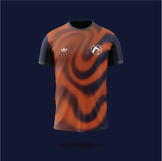
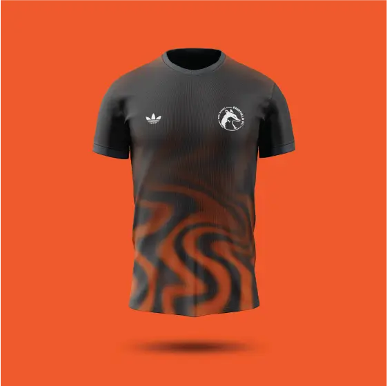
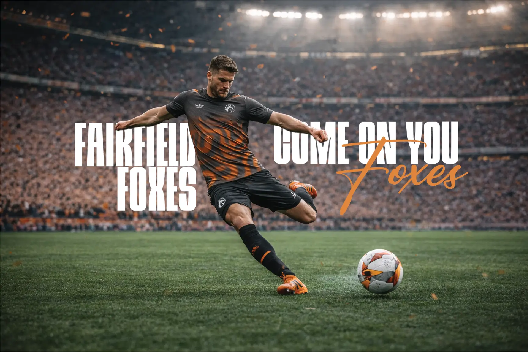
Then we designed home and away kits with a flowing pattern that feels like movement, plus matchday graphics to carry the brand onto social media and around the ground.
A club identity that feels modern and full of energy, and works just as well on a shirt as on a matchday graphic.
There's something special about seeing a crest you designed on a shirt you used to wear.
The club goes by the Foxes, so the fox was the natural hero of the crest. We drew it in profile, ears up and chin raised, with sharp, angular fur at the neck. It looks alert and confident without tipping into aggressive.
The badge around it is a simple ring, with West Sussex and Fairfield FC set around the edge.
Kept to a single colour, it works stitched onto a shirt, printed small on a ticket or blown up on a banner behind the goal.
COME ON YOU FOXES.
ABCDEFGHIJKLM
nopqrstuvwxyz
0123456789 &?!
Foxes!
ABCDEFGHIJKLM
nopqrstuvwxyz
0123456789 &?!
Football is never still, so the kits shouldn't be either. Both use a flowing pattern that twists across the shirt like smoke, or a fox's fur caught in the wind, so the kit looks alive when the players are moving.
One kit runs orange through a dark charcoal base. The other flips it, with navy swirling through orange. The crest sits small and clean on the chest, so the pattern does the talking.
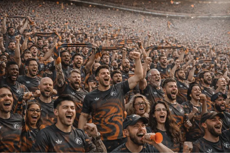
The brand had to work beyond the shirt, so we took it into matchday graphics. Tall, condensed headlines give it the energy of a terrace banner, and a brush-script "Foxes" adds personality, like a chant written by hand.
The layouts are designed to flex across match announcements, line-ups, results and social posts, and to scale up to banners around the ground.
Got a project in mind, or just a hunch? Drop us a line and we'll come back with ideas, a clear quote and honest timings.
hello@bearlycreative.uk