Aa
Headings
Syne
YOUR LOCAL EXPERTS.
800
ABCDEFGHIJKLM
nopqrstuvwxyz
0123456789 &?!
A bold, switched-on brand for a local electrical contractor, built to stand out on vans, kit and site hoardings.
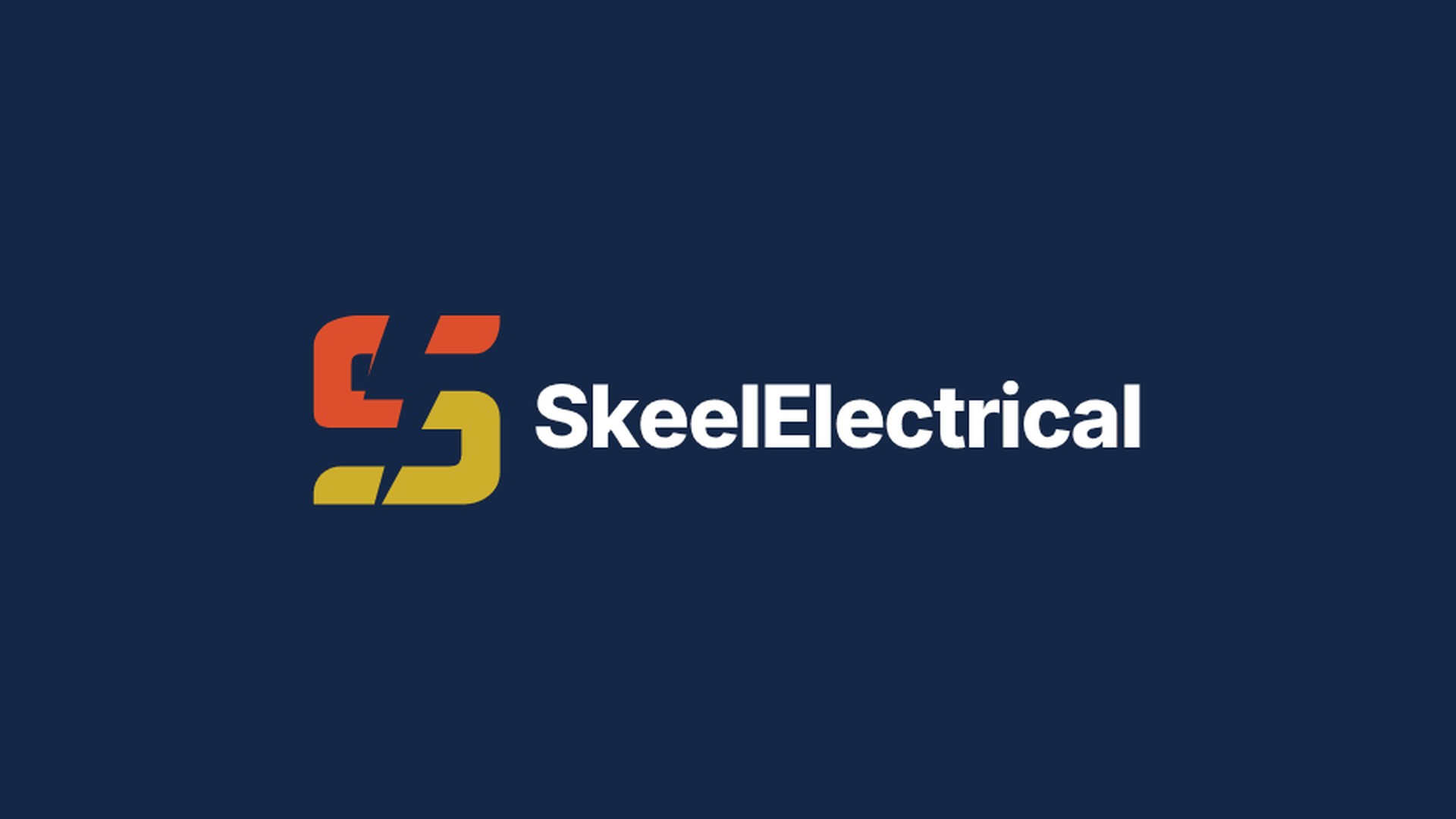
Skeel Electrical is a local electrical contractor taking on everything from rewires and fuse board upgrades to EV charger installs, for homes and businesses.
Starting from no existing brand and in a trade where most vans look the same, they wanted something that would get noticed, look professional on a customer's driveway and still feel local and friendly.
We built the brand around one idea: power. The S of Skeel is split into a red half and a gold half, with a lightning bolt cutting through the middle. It works as a monogram on its own, and sits beside a clean, bold wordmark when there's room.
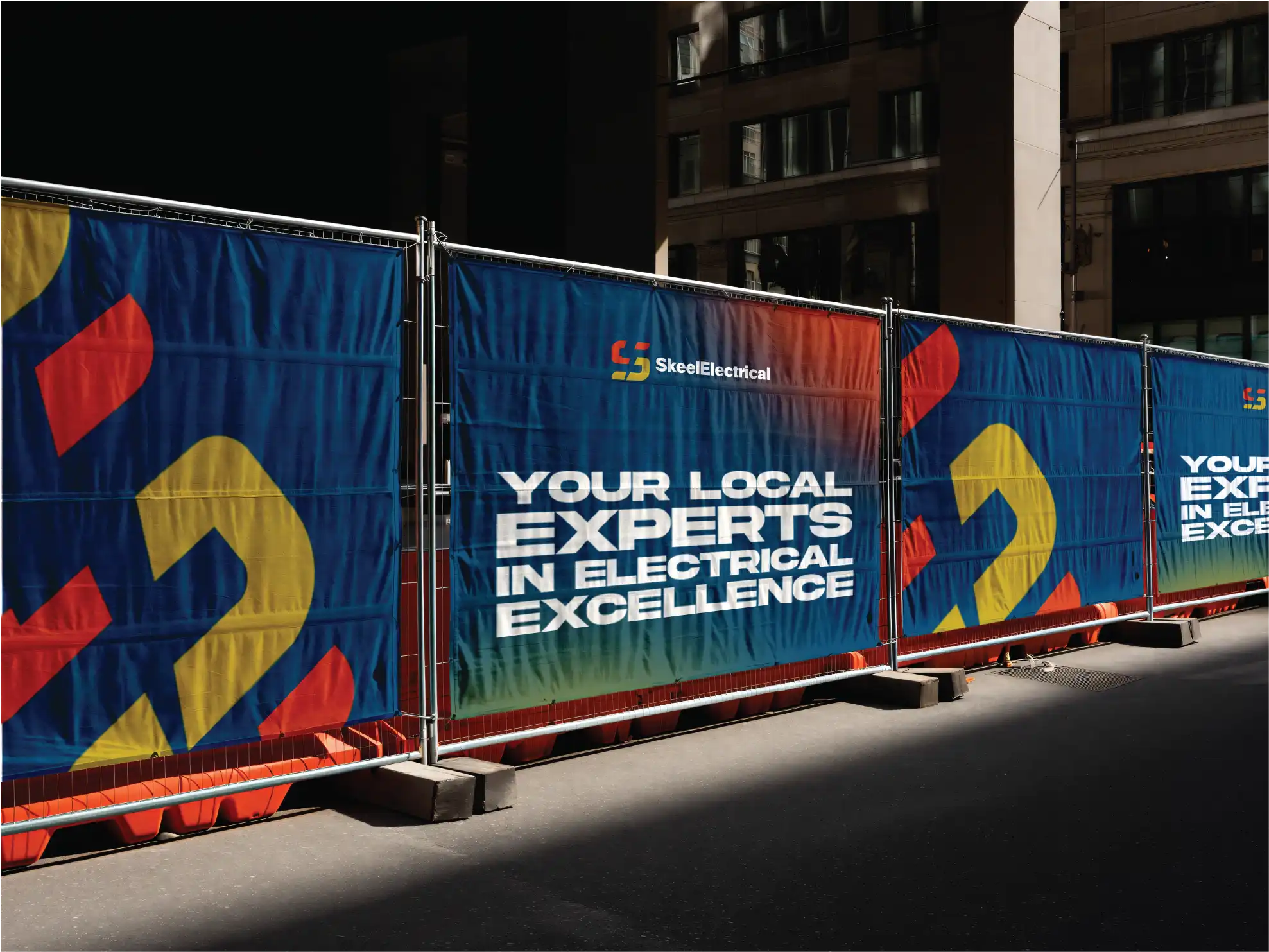
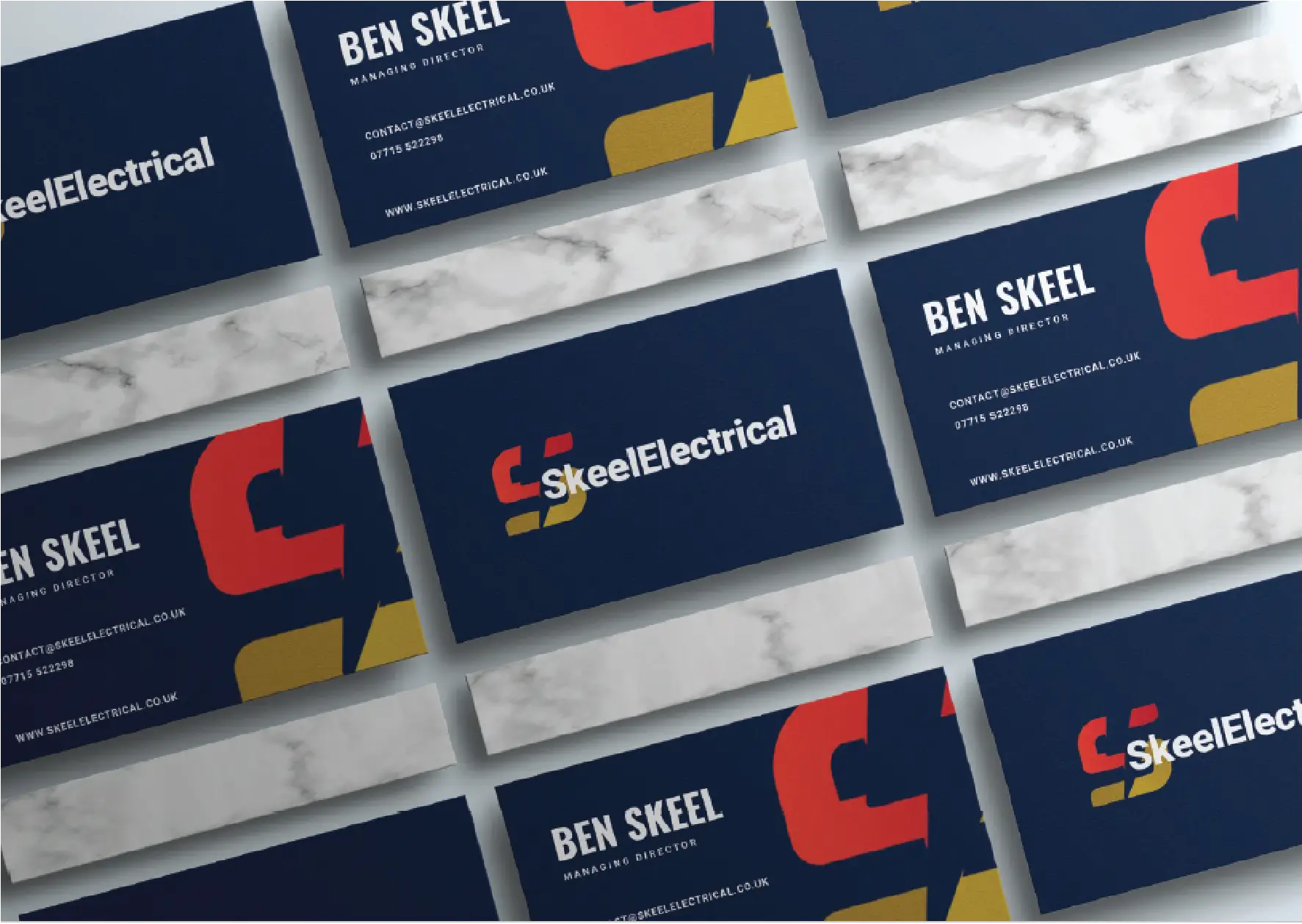
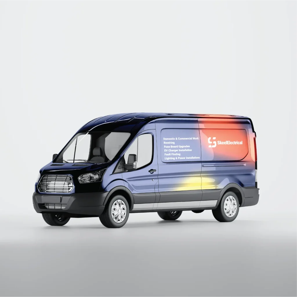
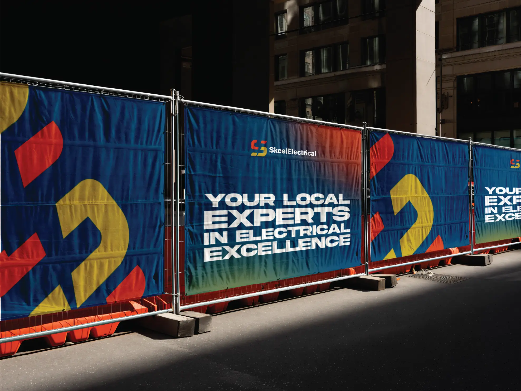
Then we put it to work on business cards, team workwear, a full van livery and site hoardings, using big cropped pieces of the mark so the brand is recognisable even when the logo isn't in shot. We finished with a short logo animation for social and the website.
SkeelElectrical now has a brand that looks as professional as their work, from the first business card to the side of the van.
Something they can be proud of, has also bought in more enquiries than ever before due to being able to stand out from the crowd.
The mark is the S from Skeel, split into two halves. The top is red and the bottom is gold, and the gap between them is a lightning bolt, so the idea of electricity is built right into the letter.
The shapes are chunky and slightly slanted, which gives the mark a sense of movement and energy. They're also strong enough to work tiny on a shirt label and huge on a site hoarding.
The wordmark keeps things simple. Skeel and Electrical run together as one word in a bold, clean sans-serif, so it reads in a single glance from across the road.
YOUR LOCAL EXPERTS.
ABCDEFGHIJKLM
nopqrstuvwxyz
0123456789 &?!
Rewiring, fuse board upgrades and EV charger installs.
ABCDEFGHIJKLM
nopqrstuvwxyz
0123456789 &?!
Electricians spend their days on driveways, building sites and in other people's homes, so the brand had to work hard away from a screen.
On the van, the services are listed clearly down the side, with red and gold glowing through the navy behind the logo, so anyone passing knows exactly what Skeel do. On site, the hoardings pair huge cropped pieces of the S with one plain promise: your local experts in electrical excellence.
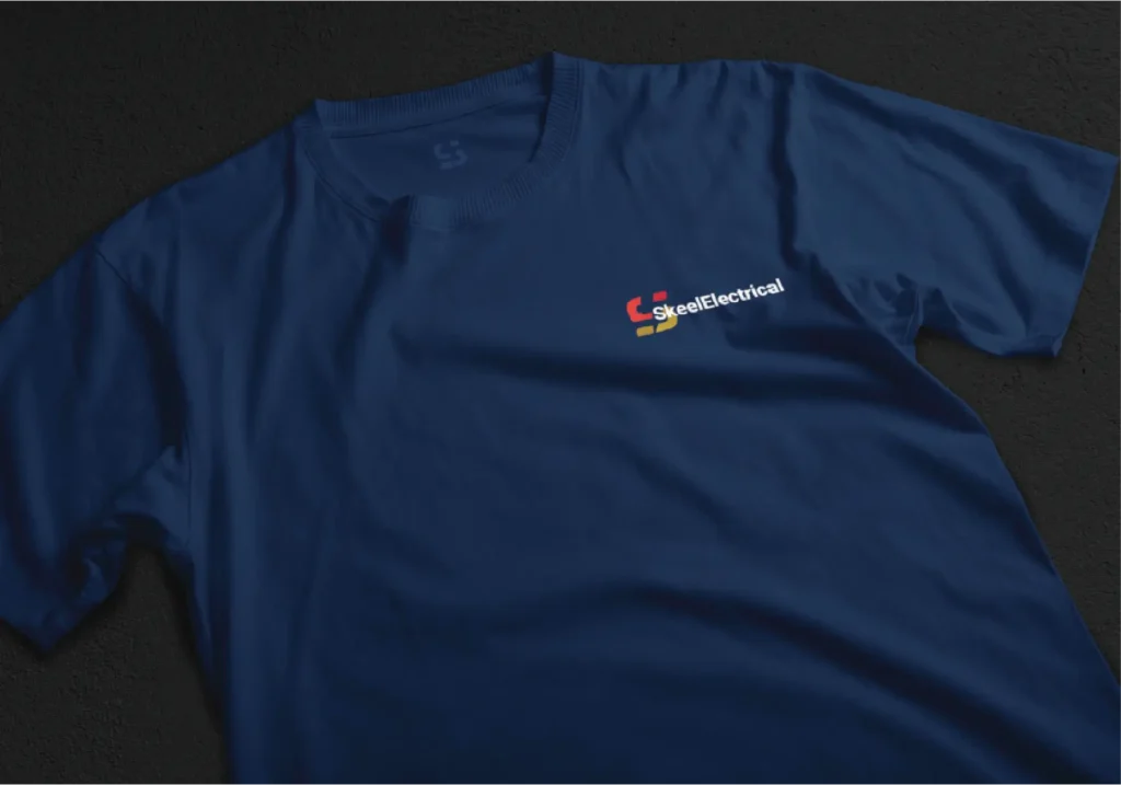
The team kit keeps it subtle, with the logo on the chest and the S mark on the neck label.
When going solo, standing out was the hardest thing.
Thanks to BearlyCreative I have a brand I'm proud of, with more enquiries than ever.
Got a project in mind, or just a hunch? Drop us a line and we'll come back with ideas, a clear quote and honest timings.
hello@bearlycreative.uk